Friday, 26 November 2010

Learning to render in smooth preview

Lately I have been using the smooth preview setting to sample what objects look like when smooth without adding vast amounts of geometry. This is a very interesting feature in maya as the mesh itself can be manipulated more easily and the object appears more realistic. However, I had some issues when trying to render the smooth preview node. I knew the render could be achieved but lacked the knowledge to do it.I asked various students whether there was a way of rendering in smooth preview but they could not tell me exactly what to do.

I eventually found some useful sites which shed some light on the issue. In order to set up the render i needed to override some mental ray attributes which would allow the smooth image to be rendered. It was a case of finding the right windows and adjusting the settings accordingly. The effect was important for two reasons.

1. Render time would be reduced
2. You could see how the object would be affected when a light was projected onto it.

Finding this information out was hugely beneficial when rendering lighting tests and saved vast amounts of time. The rendered images could then be presented to students and tutors alike so they could see what the final film might look like.

Kofi's Character/Issues


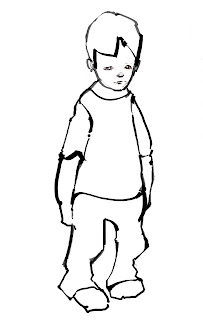
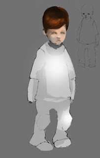
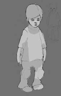
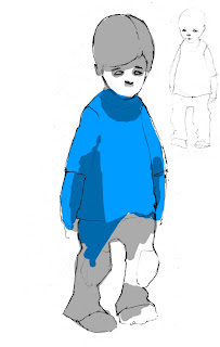
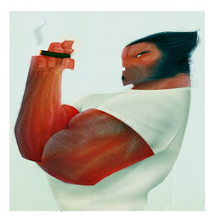
It took me a few days to get into the groove and come up with the concept. I struggled to capture the essence of the character as well as his form. This frustrated me a little, however, I persisted in the task and came up with something that was quite stylized while still being proportional to Kofi's requests. I was really happy with the final design and I was glad I stuck to the challenge as I produced a character that I was actually proud of. Figurative drawing has never been my strong suit. However, I hope to improve my character techniques by constant practice. The images above should show my workflow from sketch and outline, to colour filling and final rendering.

Wednesday, 24 November 2010

Positive Feedback from David Bull

Chris and I spoke to David Bull whilst at college who is a scriptwriter and script consultant. He had some very encouraging things to say about the story that we are embarking. We told him the basic setup and summarized the story itself. We gave him a character breakdown and the fact that Frank is a reluctant hit man who is caught in an impossible in which he has very little control.

After going through the various aspects within the story David offered some suggestions which could benefit the story and bolster the character's motivation. For example he suggested that photographs could be employed to suggest that the main character was once a boxer as well as having a scene where Frank loads his gun which suggests he will take his own life. The suggestions which he offered were very encouraging and enforced the story as a whole. He instantly got the idea that the piece was directly influenced from classic film noir pieces like Leon, Bladerunner and Sin city. He stated that the story was very coherent, subtle and character driven. He stated that the film required moody lighting, however the acting of the character was key in portraying his situation and state of mind.

David was very impressed with the amount of work we have already achieved so early on in production. From the images we presented he instantly got a feel for the character and the atmosphere of the piece. So Chris and I were naturally filled with high spirits and we feel confident that the film is achievable. However, we must not get complacent in the production process. There is still a lot to do and learn but if we use our time wisely we should succeed.

Character Concepts

When designing the character I started out by sculpting the character's head for two reasons. The first was to get the right facial features for the character and the all important character appeal. The second was to save time when drawing up the character in photoshop. Rather than drawing the characters face from scratch I could import the sculpts into photoshop and paint over them if needed. This would provide a strong template which would keep the facial features consistent.
Here are some of the drawings that I came up with.


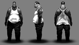
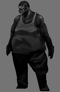
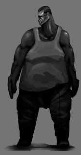
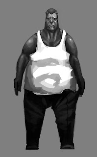
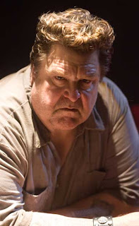
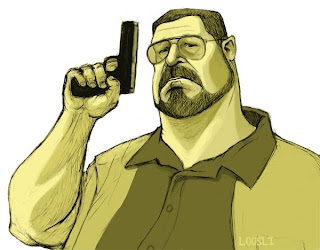
During the early conceptual stages of the character I had some issues regarding the build of the character. Frank himself was slightly out of shape. However, I kept making him too heavy which didn't fit the character nor the specifications of the director. I went through a few images before I got the right results. Some of the earlier concepts of Frank had a few animalistic qualities in the facial region which was not wanted. Using reference images of John Goodman as well as the concepts drawn up by the director I set about re designing the character. Although I did like some of the illustrations Chris felt that the physical qualities did not match his vision. I have to remember that my preferences are not always in the director's best interest so I changed the designs in the hope I could produce an image that Chris was happy with. I had feedback from several students suggesting that the character needed to be pushed slightly. Some recommended John Goodman in the Big Lebousky.

Looking at the reference material and character concepts I tried to reach a middle ground between John Goodman as well as the concepts produced by chris. The process took a few attempts but when i finally came up with a build that was appealing it was very rewarding indeed. The feedback as well as the specifications made by the director as well as other students really helped me refine the character. I eventually found the character appeal I was looking for. The image that shows a 360 view of the character was the most popular design.
Just drawing the character was a tough job as I had to create something stylized yet at the same time had to match the specifications of the director. I must remember that what the director wants is the most important thing as every aspect of a character tells you something about themselves.

Zbrush and issues

In order to get a better understanding of the program of zbrush I looked at various tutorials online which demonstrated how to create quality images and to locate the tools necessary for the job. I found some digital tutor videos which went into specifics on how the facial structure works as well as creating muscle tone and bone structure. The videos themselves also demonstrate how specific tools are beneficial for creating different areas and manipulating the geometry to fit what character you are working on. The clay tubes brush allowed me create muscle and bone structure, whereas the move tool allowed me to make quick but dramatic changes in form. This was very useful as I was able to move geometry to create areas such as the jawline and eyebrow region.

Another interesting technique was reducing the resolution of the image to create big form changes easily. I learnt to work in a specific way whereby I first created a basic shape from a sphere and then moved geometry to give the impression of facial features. Once you have the bas mesh you can then sculpt into it adding details in higher resolution levels. This made for more efficient modeling and saved time.

The only real major problem I had was creating the ears and eyes. These areas have overlapping areas and flappy bits of skin with quite a bit of detail. The ears were relatively easy with a little practice . I also stylized the ears by simplifying its features. The eyes were very difficult in terms of modeling. However, it was important to get that despondency with the big eyebrows that was essential to the character. The eyelids themselves were very tricky as they needed to be detailed in a higher subdivision mode. At this point I had no idea how to create the eyeballs that would really sell the character. I had to mirror the eyeballs but the version of zbrush that I posses had a really long winded way of doing this operation. I struggled for some time to get the tool to work and realised I needed some help. Fahran Younas, a friend of mine kindly showed me a plug in that would solve this issue. The plugin was located on the Pixologic site. This made the mirroring process ten time easier and I was able to create that character appeal I was looking for. It was amazing to see the impact the eyes had on a character and you could get a sense of the desperation felt by the character. This was a magical moment and I was very impressed with the quality of the images.

My Character designs for Frank

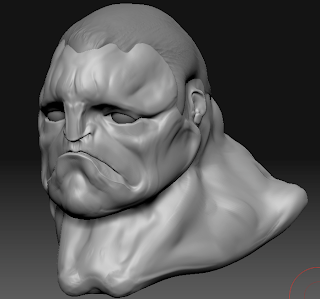
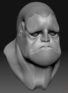
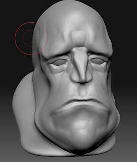
Using the reference images Chris gave me I came up with my interpretation of the character. I spent some time sculpting some Zbrush busts of the character to get an idea of the facial features. This will hopefully give the character some appeal. I focused on the large eyebrows and stylized jawline like the one the wolverine had. I wanted to get the facial features right before I got bogged down with the main body of the character. By creating these character busts I was able to adjust their features quickly and easily according to Chris's instructions. This would save huge amounts of time when designing the character. I referred to Chris's drawings for reference to reach a middle ground between his designs and the reference images. Here are some of those sculpts.

Looking at all the character busts I am definitely more happy with the most recent designs. This is due to a couple of reasons. While going through the development stage I picked up some new techniques and also looked at real human beings to understand the structure of the face. With the basic knowledge of how muscle tone and bone structure affect the facial features I was able to create more interesting and stylized concepts. Looking at the earlier concepts they lack character appeal and the first one looks a bit to heavy. Taking the advice of the director as well as several students I began to focus on character appeal.

There was a lot of trial an error in coming up with the right facial expressions and build for the character but as I gained more insight into how the face works as well as Zbrush itself I was able to create better quality images. I can defiantly see a progression throughout the process. Not only was this a good exercise in character design but also in understanding the program of Zbrush itself. Although I have a long way to go i can definitely see some improvement here. A large part of Zbrush is experimentation as well as knowing what tools to use and where to locate them. Once you have the right tool for the job it makes the whole sculpting process far easy and you can produce better quality work.

The most recent images I had produced lacked the character appeal I was looking for and there was no sense of desperation on the characters face. The facial expressions would sell the character, so it was important to get this aspect right. The process took some time, however the zbrush allowed me to make changes easily according to the specifications of the director.
Although my first images were undesirable, they were necessary in my development in both character design as well as understanding the program.


Frank/Designing the character
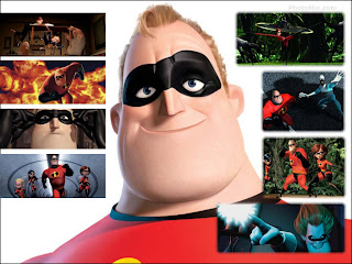
The character of Frank is a complex character. Chris wanted him to be quite realistic but stylized in some areas. Frank is roughly in his late 40's and is caught in a downward spiral of crime and murder. He is indebted to the mafia because of information he knows that he could use against them. Rather than dispose of the witness they employ him. Fearing for his own life Frank reluctantly agrees to work for them as a contract killer. In order for the character to work we need to show the emotional struggle Frank faces and the way in which the work he does slowly devours him as a person. Will he decide to break free from the shackles of crime and corruption or will he be consumed by his vices. His moral compass will surely be tested and this will be key when we finally animate frank. We have to show the audience the impossible situation that Frank finds himself in and the way in which he deals with that situation.

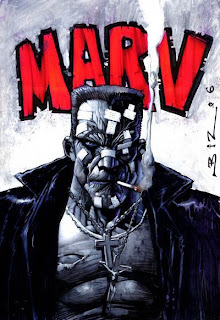
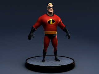
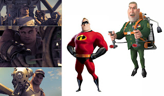
Franks physical features will immediately paint him as a brute, a physical person who is now slightly out of shape due to drink and his age. Chris had already designed the character prior to the pitching stage. However, there were some concerns that he looked to like Marve from sin city. I set about designing a character based on his designs as well as some character references from various films like the incredibles, the big lebousky, sin city as well as some stylized characters like wolverine.

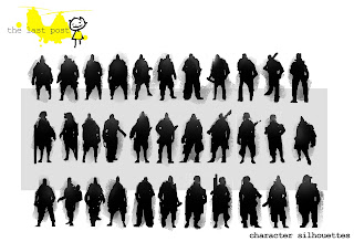
Looking at the reference and observing the characteristics and build of the characters I started to block in a basic character silhouette. The character of Frank was once a boxer so I had to consider this when designing the character. His shoulder region needed to be pronounced but I also had to take into account his age and lifestyle. The character had to have al little access weight which suggests that he is drinking and that he spends most of the time waiting for a new contract. Everything about the character needed to tell you something about him. His facial expression should tell you something about his state of mind, his despondency and his posture should suggest how he slumps himself over a table. All this makes for a more believable character. The last thing I wanted to do was to portray Frank as a cold hearted killer. This was not the intent in the script. His state of mind is utter desperation, he has to go through with the contracts in order to survive but is in emotional disarray.

Here are some of the character references I used for the character. I used these images in order to obtain an understanding of character appeal. I was also looking at certain features that could be applied to the character such as exaggerated jaw line, big arms thick neck. All these aspects will enforce the character and will make him more believable.


Wednesday, 17 November 2010

Personal developement

This year I will be working on a short film called “Patience.” The story itself revolves around a hit man called Frank. He is roughly in his late forties caught in a downward spiral of criminal blackmail and corruption. He ultimately has to decide whether or not to kill his lover or discard the contract completely. The story features the moral struggle that Frank faces, does he overcome the shackles of his past or do they consume him.

Lately I have been working on various concept designs for the main character Frank as well as making 3d models for the various scenes in the story such as chairs, sofas, tables and the apartment itself.

In order for these objects to work within the scene they have to be relatively low in resolution that is to say that they can be made only by a few polygons. However, they need some resolution so when they are sub divided they retain hard edges and slight bevels.

I didn’t have much knowledge in sub divisional models prior to the project. In order to create objects that would have high detail when rendered I needed to find out how to use edge flow and sub divisions in Maya effectively. I looked at various tutorials online such as you tube and digital tutors. I acquired some video tutorials from my father who works in the film industry. Some of these video tutorials were very helpful indeed. I needed to create a space for the main character within Chris’s story. The space had to be big enough for the character to walk around in and had to be big enough for several pieces of furniture such as a table and chair as well as a sofa. Although the floor plan had been drawn up I still had to use the geometry in the space to my advantage. For example the geometry had to be good enough for manipulation as well as rendering and UV mapping. If the polygons within the scene were made up of more than 4 sides this would cause discrepancies within the mesh, which would cause problems when it came to texturing the surfaces in the room.

The tutorials were very helpful in this respect as it helped me to construct the apartment space in a logistical and pragmatic manner with good workflow. The tutorial itself from digital tutors also went into great detail in making furniture in the room. Although the chairs and table were too modern for the story I used the tools and techniques and applied them to the objects Chris wanted. I also learned of about new tools that could create nice effects very quickly. These tools include things like taper, and bevel to create seem lines on cushions for example. Knowing where these tools are and how to apply them will be hugely beneficial when it comes to modelling objects in the future within Maya.

I have also been experimenting with Zbrush recently. It is a sculpting program heavily suited for character creation. This programme has made the concept stage so much easier as I can create character busts in a very short amount of time. This is very handy if someone wants a character design done. Using the programme I can manipulate the mesh to the specifications of the director. Rather than drawing up several concepts for a character I can narrow that down just to one. Zbrush makes it very easy to adjust features like the ears, nose mouth and eyes very quickly as well as the width and height of the head itself. This saves huge amounts of time in the production process.

I have been using video tutorials online, which primarily deal with zbrush characters and creature creation. Although this has no direct relevance to the projects I am working on at present it has given me a better insight into the way in which anatomy works. For example the artist who works for pixologic starts off his character by blocking in the basic shapes of his character moving the geometry into position to get a rough silhouette. Then you can start building up muscle and bone structure using the default tools available. Although the tutorial primarily deals with creating some sort of demon the character itself is largely based on real human anatomy. The artist shows you where the defining features of the face are the bone mass near the corner of the eyes as well as the supple flesh around the nose and mouth. By observing the way in which he creates his images I have a better understanding of the way in which muscles relate to each other and the dramatic changes in exterior appearance through bone matter.

I have not just gained an insight into the inner workings of the human body but also the workings of software like zbrush. The tutorials themselves deal with a whole range of techniques and effects created by different tools and parameters. For example I have learned to create supple skin tissue using the clay tubes brush which when smoothed can also create muscle tone. I have been exposed to the way in which alpha channels work to create detailed patters such as leathery skin as well as hair. Just talking to students at college I have learned a few tricks, which make the production process easier, more productive with a better quality result. All this information will be hugely beneficial to my artistic development and will ultimately augment my portfolio.

Kofi's Character for Heroes

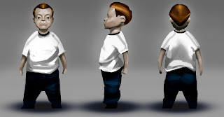
My brother had designed a character concept for Kofi's protagonist earlier in the production phase. However, we came to the agreement that the character looked to old for the story. Kofi wanted a character that was roughly 5 years old. The character had to be slightly chubby. The character is an adorable little child that thinks he has super powers, so I thought that the character might be too big for his own shoes. That is to say he thinks he knows how the world works but is ultimately naive. When designing the character I set about by sculpting the characters head as this was the most important part of the character. It is here where the character takes shape as we can relate to the visual qualities of the subject. Kofi gave me lots of reference from various pixar films such as ratatouille and the incredibles. I also looked at real photographs of young children to fully understand their facial characteristics.

Many 5 year olds have slightly supple skin and their heads are quite large in comparison to their bodies. When sculpting the character I tried to take these points into consideration. The character himself had to be slightly stylized to fit in with the bright environment around him. When sculpting the boy's facial features I started by blocking in the eyes nose and mouth to get a better idea of the character. I started sculpting the character in zbrush for one of two reasons. The first was to really understand the boys facial characteristics and really explore his appeal. The second was purely about getting the character sorted relatively quickly. The beauty of using zbrush as conceptual tool is that you can adjust whatever it is your sculpting quite quickly. I was able to show Kofi my progress and if there were features that needed adjustment I was able to do it relatively easily. I was able to sit down with Kofi over my shoulder so he could point out areas that needed improving. This was great as I could model the character exactly as he wanted.

Here are some of the sculpts that I created using Zbrush. Using the reference material Kofi gave me I set about creating a character. I paid careful attention when creating the supple skin as well as the small stubby nose. The eyes were a huge selling point and these needed to be jst right in order to make the character appealing.

The first image was created early on in production using the reference available to me. Originally Kofi wanted the boy to have some sort of a quiff, this was abandoned however as it didn't fit the character as it made him feel to old. The first image is highly stylized but I was later told he looked to old as his skin didn't feel supple enough. With constructive criticism from various students as well as kofi's instruction I set about adjusting the characters features. For example I made the ears smaller, I brought the eyes down towards the cheeks and created a more realistic mouth for the character getting rid of the hard edges. I think the first character failed to inspire Kofi because of his elongated neck which was not befitting to a 5 year old. I tried stylizing the boy too much, but I leaned some valuable lessons in character development as well as proportion.

Zbrush allowed me to do this quickly and effectively which will hopefully speed up production time. If I had drawn the images, no matter how fantastic they would have been they would not have met the requirements in Kofi's story. His vision is paramount and Zbrush allowed me to create a character very near to what Kofi had envisioned.

I learned some very important things here not only about character proportions but also about the pipeline. Rather than doing many concepts that would have been time consuming I narrowed it down to around three which will be beneficial to Kofi's tight schedule.

The second character created in zbrush is far more suited to Kofi's story and specifications as he looks more like a naive but adorable little boy than an old man! I am ver pleaded with the way in which the character turned out, but I suppose I was more overwhelmed with the amount of constructive criticism that turned the character into what he is now. I am very grateful to all those who inspired me and taught me a few things during the characters creation.


Wednesday, 10 November 2010

Small Group

Originally Chris wanted quite a few people working on the project. However, we now have a slight problem because of the way in which the grouping process was handled. Although there are a few people working on the project Chris and I will be the primary producers on the film. All the responsibilities within the film now rest on our shoulders. This can be seen as a disadvantage, however we are confident that we can meet the schedule and still produce high quality work. This does mean that I will have to model the main character in the piece. As yet I do not know an awful lot about character modeling, but this can be learnt and this will provide me with new skills that will ultimately augment my portfolio and I relish the challenge.

Reasons for Choosing Patience

Although my pitch was one of the chosen few to be selected after the pitching process, I knew there were a few holes regarding technical aspects within the film. Without these technical aspects the film would not work as a whole. For example I had not thought about the apartment in which the soldier was staying before the drop. I had not considered lighting, textures and styles of the furnishings. The Helicopters had not been designed fully to warrant a decent model. I had not considered the music and sound effects needed for the piece.

The story itself is sound, however there are quite a few things that need to be resolved. I strongly believe that the tutors chose my idea for its visual look and the not the story. This was partly why I chose to work on my brother's project. The primary reason for working on my brothers idea was that I knew he had considered all the aspects of his film which include music, lighting, space, furnishings, textures. All these things coupled with a strong script as well as a storyboard meant that all the pre production had been done before term time. Chris also produced some character concepts and mood pieces to show how exactly he wanted the light to effect the scene in his story. The idea made perfect sense and I knew that there would be no discrepancies in the production process.

I chose to work on Christopher's short film purely for professional reasons and I strongly believe that I made the right decision based on the information that has been made readily available to me.


Mood Board

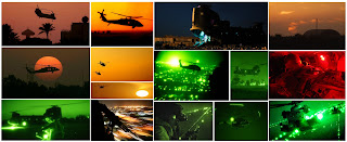
I needed a mood board in order to narrow the color palette of the piece. The story was set during the sunset hours so I concluded that the opening sequence should be shot with orange tones as well as dark yellows. The midnight sequences presented a very different problem. For the helicopter scenes to work they needed illumination from settlements below. I thought of having the scenes done as if they had been shot using night vision.

The colors represented in this mood board just show the sort of color palette I was going for.

Character designs

I wanted the main character to appear physically strong, however I wanted his facial expressions to emulate a certain despondency and reluctance for the job in hand. I knew that the tutors wouldn't go for a realistic character, so I stylized him somewhat for their benefit. I also took into consideration the time he would take to model and render. I suppose I was going for character not too dissimilar to Mr incredible. He had the responsibility of a father but a physical appearance that was somewhat overbearing. I also looked at an animation short called rock fish where the character had a certain amount of character appeal as well as the general from Monsters vs Aliens.

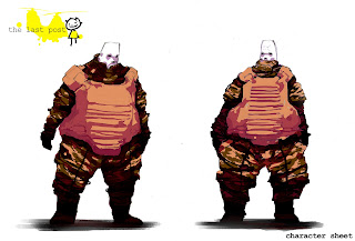
Here are the initial silhouettes and final concepts.

I was very happy with the overall outcome of the main character. Initially I was looking for a more realistic soldier. But I went for a more stylized version where certain features like his legs and upper body were exaggerated. This would make the modeling process slightly easier.
When coloring the character in photoshop I started with a dull grey tone to get a rough silhouette. I then added a lighter grey to create the camouflage patterns as well as the bullet proof vest. I wasn't very happy with the color initially as it looked too bland and two dimensional. I then set about changing the brightness and contrast as well as the color balance of the piece that instantly created a cell shaded look that I was trying to recreate which offered more character appeal. It is quite fascinating to see how color can completely change the tone of a concept. The drawing itself reminded me of characters from the Manga Film Akira.

I was overjoyed with the outcome of the soldier, now I needed to create a mood board for project as well as some small vehicle silhouettes for the helicopters.


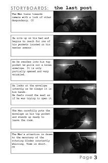
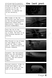
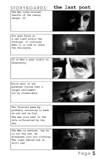
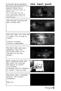
Storyboard for the Last Post


Here are the storyboards for my pitch idea. Although I wanted to work on my brothers project I think that it is important to show my development leading up to the pitching stage.

I only wanted to use black and whites for the storyboard itself as I wanted emphasis on light and mood. The mood within the story is very dark and an atmosphere of shear hopelessness is present throughout the film.

I presented the script to a few people before presenting and there reactions and feedback were positive. For example my mother and father emphasized the fact that the piece was contemporary and relevant to the tragedies occurring in the middle east.

When writing the script I wanted the reader to feel a sense of urgency and despondency, the relationship between a parent and their child. I thought I made a good attempt at character build up. I was especially pleased with the ending when the soldier gets closer to the drop zone. The helicopter itself is taking fire and the soldier can do nothing. He is at the mercy of forces outside of his control. He has been a father to his daughter, loving and supportive guiding her to adulthood, now the tables have turned. He is under control by his superiors whose objective is unsympathetic. Although the daughter never appears in physical form during the course of the story, she is present in mind. The letter is symbolic of the fathers love for his offspring.

Although there may be a few frames missing I tried to draw up the main beats of the story that would help explain the soldier's predicament. Some frames could be re drawn as I am unhappy with the camera angles and composition, however on the whole I am pleased with their outcome. The techniques and knowledge I learned during the storyboard stage can be applied to other projects in the future. When drawing out the boards I considered both lighting and composition to get the most out of each shot.

I cannot stress the importance of the script when creating a story. Some of the tutors believed that the script was not essential in the pitching process. It is paramount that the script is completed before any pre production work can go ahead. The script determines the look of your film as well as the pacing. If no script is present then the film is doomed from the start.
I was only able to draw up some interesting boards and character designs because I had the script at my disposal that dictated every shot. There was also a certain amount of belief in my characters as well as the story that augmented the design stage.


Last Post Script

The initial idea was heavily influenced by my brothers work for patience about a guy who recieves a letter that causes huge strain on the character in question.

Here is a section of the script for the Last Post.

THE LAST POST

A faint whirring sound grows louder. Its source getting closer..

FADE IN:

EXT. MIDDLE EAST SKYLINE - DUSK

CHINOOK TRANSPORT HELICOPTERS pass the horizon above small settlements. Smoke pillars can be seen in the distance.

INT. APARTMENT - DUSK

A man’s face. His features indicate a strong, physical person. However, his expression indicates unhappiness and desolation. Only the side of the MAN’s face can be seen as he looks at the fan. The MAN seems to be waiting for something, lying down looking beyond the monotony of the rotating blades of the fan. The MAN is backlit from some kind of strong light source, al light bulb .His eyes open and close as he thinks to himself. Again he looks at the fan and turns his head.

He rolls over and sits up. He focuses on his front pocket above his Kevlar vest. He reaches for the envelope inside the pocket. It is partially opened. The MAN reaches for it and holds it in one hand. It is wrinkled and worn. He stares at the envelope near his face intently.

He seems to know the contents within the worn envelope. His eyes close as a worried look consumes his face - a look of utter sadness. The MAN rests the envelope on his chest. The MAN turns his head facing the fan as it rotates endlessly. Time is short the mission is near.

The spinning of rotor blades can be heard as we close in on the fan.

DISSOLVE TO:

EXT. DESERT – DUSK

The fan becomes the rotor blades of a CHINOOK TRANSPORT GUNSHIP. The helicopter appears to be moving fast high above the baron desert below.

INT. CHINOOK - THAT MOMENT.

The MAN sits within this vast military vehicle looking out into the coming night through one of its tiny portholes. CU on the MAN’s eyes - a sense of emotional attrition. His chest pocket contains the brown envelope we have seen before. It is still only partially opened.


Friday, 5 November 2010

Personal Pitch: The Last Post

My story involves a soldier waiting for his next mission in the middle east. He knows his destination, however his survival is uncertain. He keeps a letter that is only partially opened. It is from his daughter. He can't bring himself to open it as it is too unbearable for him to know he will leave her without a father. He readies himself for the coming mission, he rides a chinook helicopter into battle where he ultimately meets his demise. The story portrays the emotional struggle that the soldier faces as he knows his fate. It is a contemporary piece that addresses the hardships felt by those soldiers already in the frontline. The soldier knows he has reached the point of know return, there is no way to escape from the onslaught that awaits him.


The Pitch: Patience

I chose to work on this project as it had been well thought through. My brother and I discussed the story and the main character many times over the Summer break. The story is primarily about the emotional struggle felt by the main character who ultimately has to decide whether or not to go through with his latest contract. For me this story was the most mature out of the many pitches that were presented during the beginning of term. The story is simple yet character driven and has huge potential for those who want to show off their conceptual talent as well as their modeling skills.

I think that it is important to mention that my brother and I wish to work in the film or gaming industry. The work we want to produce during the last three terms should reflect our style and technical know how which will render us more employable to these industries. The piece itself will be stylized, however the techniques used to create the environments lighting and objects will prove useful for the future. Although I want to produce a coherent film by the end of the year, the skills needed to make the film a reality will be hugely beneficial in terms of work placement. This project is the start of my career so I believe that it has to be tangible, relevant to the work you will be doing.

The story itself borrows heavily from the classic Film noir genre. Looking at the images Christopher had designed I immediately related to the character as well as the environment.
The room itself was small and dark, lit from only a ceiling lamp. Some background light can be seen through the venetian blinds. The use of light immediately evokes a mood as well as a foreboding atmosphere.

Another thing that was intriguing was the use of props within the story. They all had meaning.
Frank has many possessions that tell you about his character and augment the story as a whole. I was also intrigued by the main character in the story. His physical qualities are intimidating, however it it just a facade that hides the characters insecurities and moral struggles. He is not your classic hit man as he is roughly middle aged and out of shape due to his solitary lifestyle.
The character has vices, but will he overcome them or allow them to consume him. This was a very mature take on the hit man genre, rather like In Brudge.

I also chose to work on the story as it was probably the only pitches to have been thought out in great detail. For example Chris has thought about the plan of the room, where the light is coming from, where the character will be, the props within that room, as well as the music for the piece. Chris also developed a script for the project. This is imperative for all kinds of film making whether it be feature or short films. Because Chris had a script I could relate to the character first hand as the story unfolded. Chris had obviously gone into detail and this reassured me. The story is somewhat complicated, however with the script present, everyone working on the project knows what he or she is doing. The script allowed for a storyboard to be done and dictated every aspect in the story from character to props. From a professional standpoint this was very exciting as I knew everything that needed to be in the story had been incorporated.

I knew that in the unlikely event that something went wrong in the production phase things could be resolved quickly. If anything needed adjusting we could refer to the script which is one of the reasons I wanted to work on this piece.

Some of the tutors had some issues with the idea. I think this was because they thought the idea would be realistic. I think a few people also thought that the complex story wouldnt be able to be told in roughly three minutes.

Some of the tutors took convincing so we had to change the idea to suit some of the targets set by the brief. We agreed that in order to continue the story itself needed to be somewhat stylized. The script is also open for a few minor changes, however I think the story is strong and the objects within it are relatively easy to model. Looking at all the preliminary work that went into the story as well as the concepts and storyboards my brother and I are confident that most of the objects can be made before christmas. The only issue really is the main character himself as he needs to be modeled, rigged and animated accordingly.


Patience

The story explores the emotional struggle within a hit man named Frank. Frank is roughly in his late forties. His physical appearance is somewhat intimidating, however his emotional state paints him in a very different light. He is vulnerable and scared. His muscle tone although diminishing as well as the boxing gloves on the wall, tell us that he once used to be a successful fighter in his hay day. Now Frank is caught up in the criminal underworld. His apartment is bare but some belongings are scattered around the room. We get the idea that Frank moves from place to place looking for new contracts. He waits for the next package. Upon arrival he is stunned and dismayed as the contract involves his lover. He needs to decide whether to abandon his contract or kill the only person who he ever loved.